
Timeframe
The dashboard broken down by period: spend, visits, conversions and revenue for every channel, by day, week or month
Timeframe is the dashboard broken down by periods. The same rows, the same saved view, the same four numbers, but instead of one total for the date range you get a column per day, week or month. The dashboard tells you where a channel ended up; Timeframe shows how it got there.
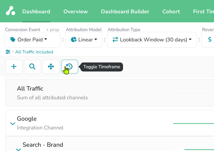
You open it from the dashboard itself, with the fourth button in the toolbar, so nothing needs to be configured twice.
Examples: demo project, 2024 by month, Order Paid · Linear · Lookback Window (30 days) · All Revenue. The April column matches the Dashboard page's April example.
Opening the breakdown
Click Toggle Timeframe and two things change. The control bar gains Agg. Period next to the date range, and the columns become a Total followed by one column per period. Click the button again to return to the dashboard.
Which periods you can choose depends on how long the date range is:
| Agg. Period | Available for a range up to |
|---|---|
| Day | about 100 days |
| Week | about a year |
| Month | any length |
Pick a longer range and the shorter periods drop out; a notice under the date range names the ones that are not available for the dates chosen. In the example, a full year is shown by month and the notice says Day is not available.
Reading the table
Each row carries the four metrics of the dashboard: Spend, Visits, Conversions and Revenue. The Total column is the dashboard's figure for the whole range, and the period columns split it. The Total column also carries the conversion overlap percentage beside Conversions; the period columns do not.
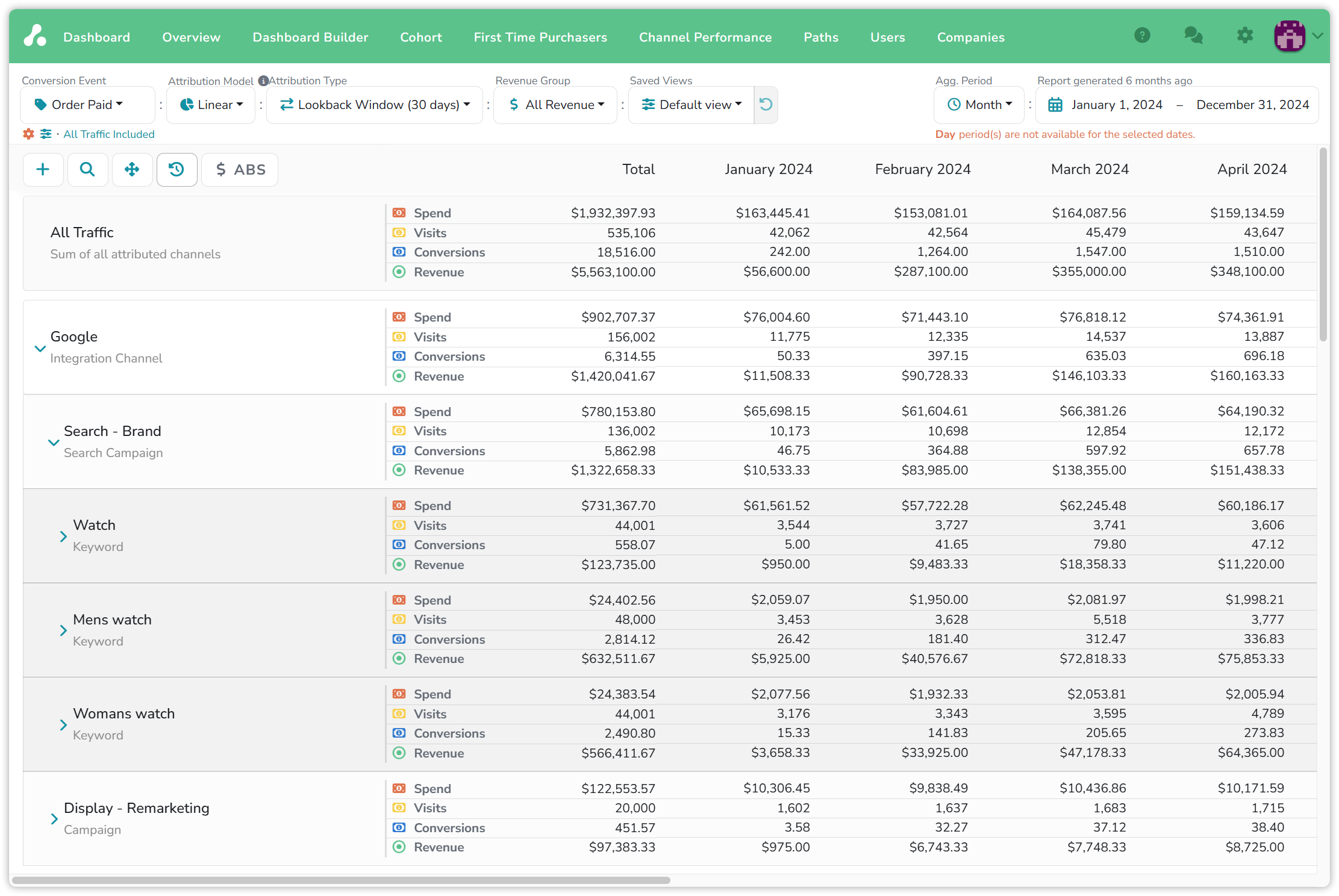
Google spent $902,707.37 over the year for $1,420,041.67 of revenue. That is what the dashboard shows for 2024. The months show something the total hides: the channel started the year almost cold, $11,508.33 of revenue in January, and was at $160,163.33 by April. The Search - Brand campaign under it went from $10,533.33 to $151,438.33 over the same four months on flat spend, so the growth came from conversions, not from budget.
Rows expand as on the dashboard, channel to campaign to keyword, and every level has its own period columns.
$ ABS / $ REL switches the period columns between values and the change from the previous period. REL turns a row that is gaining or losing into a line of plus and minus signs, and hovering a cell shows the values behind it. The First Time Purchasers report has the same toggle.
Inspecting a period
The table is large, and you are not expected to read it. Every visits, conversions or revenue figure in a period cell is a link. Click it and the sidebar opens for that row and that period only, with the visits or the conversions behind the number and each visitor's timeline, the same sidebar as on the Dashboard. A month that looks wrong is three clicks from the visitors who made it.
Timeframe and Overview
The Overview report charts this data: two metrics for one source, All Traffic, a channel or a filter, at the same periods. Use Overview to see the shape of a line, and Timeframe to see every row at once and to click into the numbers.
Reading the numbers
- Periods follow the Attribution Type. Under Lookback Window a conversion sits in the period it happened in, credited to the visits inside its window. Under Marketer Spend View the credit sits in the period of the visit, for the conversions that visit led to. The same month can read differently under the two types; see Attribution types.
- Spend is by the date reported. It lands in the period the ad platform reported it for, or the date you entered it with.
- Fractional conversions are the attribution model splitting a conversion across the visits that led to it, as on the dashboard.
- The Total is the dashboard. If a Total disagrees with what you remember from the dashboard, the saved view or the date range has changed, not the data.
Updated about 15 hours ago