
Read your dashboard
The dashboard in one sitting: what the control bar sets, what a channel row tells you, and how to open any number to the visitors behind it
The dashboard answers one question for every channel: in this date range, under these settings, what did we spend, what did it bring, and what came of it. This page reads it on the smallest project that can show the whole thing, the three-visit journey from From visit to conversion: one visitor, an organic visit, a Google ad, a Meta ad, and a $120 purchase. Three rows, one order, and every number on the screen can be checked by hand.
The control bar
The settings along the top decide what the numbers mean. On this project they are:
- Conversion Event: Order Paid. The event the dashboard counts. Pick Signed Up or Demo Requested instead and the Conversions column counts that; see Conversions and revenue.
- Attribution Model: Linear. The rule that splits a conversion's credit across the visits that led to it; the five models are on Attribution models.
- Attribution Type: Lookback Window (30 days). Whether the date range selects conversions and looks back for their visits, or selects visits and looks forward to what they produced; see Attribution types.
- Revenue Group: All Revenue. Which events' revenue the Revenue column adds up; the default counts every event that carries revenue.
- Saved Views: the Docs example view, which holds all of the above so that everyone opening it sees the same numbers; see Saved views.
- Date range, at the right: September 2026 here.
Hover any of these labels in the app and it shows the same one-line definition with a link to its page.
How the credit is split
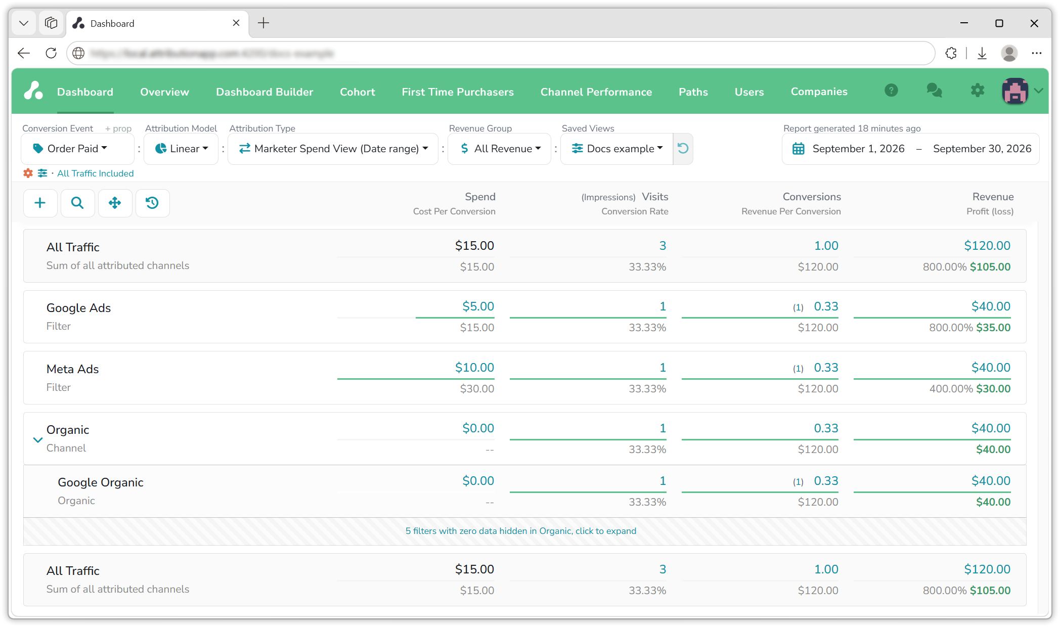
Under the Linear model every visit before a conversion earns an equal share, so the one conversion and its $120 are split three ways: $40 to Google Organic, $40 to Google Ads, $40 to Meta Ads. The conversion itself is shared the same way, which is why each row shows 0.33 conversions rather than 1: a third of one Order Paid event. On the dashboard that is three rows with $40 each.
A row, left to right
On the dashboard the same $40 appears on each row, and now spend enters the picture. Google Ads earned $40 for $5, a return of 800%; Meta Ads earned $40 for $10, a return of 400%; the organic visit earned $40 and cost nothing. All Traffic sums it up: $15 spent, $120 earned.
Five figures are worth reading first, on the Google Ads row:
| Figure | On this row | What it is |
|---|---|---|
| Spend | $5.00 | What the ad cost, from the ad platform |
| Conversions | 0.33 | The row's share of the conversion event |
| Revenue | $40.00 | The row's share of the revenue, split by the same model |
| Cost Per Conversion | $15.00 | Spend divided by conversions |
| Profit (loss) | $35.00 at 800% | Revenue minus spend, and revenue divided by spend beside it |
The other three columns, Visits, Conversion Rate and Revenue Per Conversion, and the sidebars behind every figure are on the Dashboard page.
Two columns, two settings
Conversions follow the Conversion Event; Revenue follows the Revenue Group. Switch the Conversion Event from Order Paid to Demo Requested and each row shows 0.33 of a demo request, and still $40 of revenue: the $120 sits on Order Paid, and All Revenue counts it whatever event is selected. Set the Revenue Group to Conversion Event and the revenue drops to $0, because a demo request carries none. Conversions and revenue explains why the two are kept apart and what to do with it.
Behind every number
Every blue figure is a link. Click the conversions or revenue figure on a row and the sidebar lists the visitors behind it, each with their share; click a visitor, Marcus Aurelius here, and their whole timeline opens, the three visits and the purchase you saw on the previous page. The sidebar also draws the visitor's own credit split as a donut, the same thirds as the three rows.
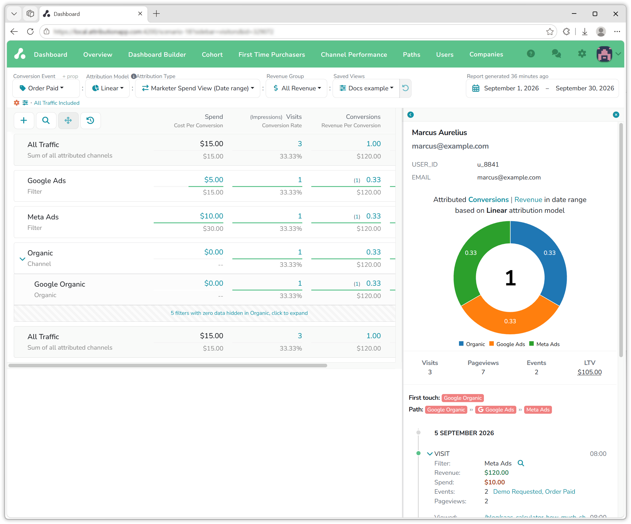 The Dashboard page shows the sidebars on a full project.
Two rows frame the rest. All Traffic, at the top, is the sum of every row below it after modeling. Raw Traffic, shown when you click Show Raw data at the bottom, is every visit, conversion and revenue in the range before any model touches it, the row to check against your own order system. Here both say one order and $120.
The model is a setting
Switch the view to First Touch and the whole $120 moves to the visit that started the journey, Google Organic, while both paid rows show $0 against their spend.
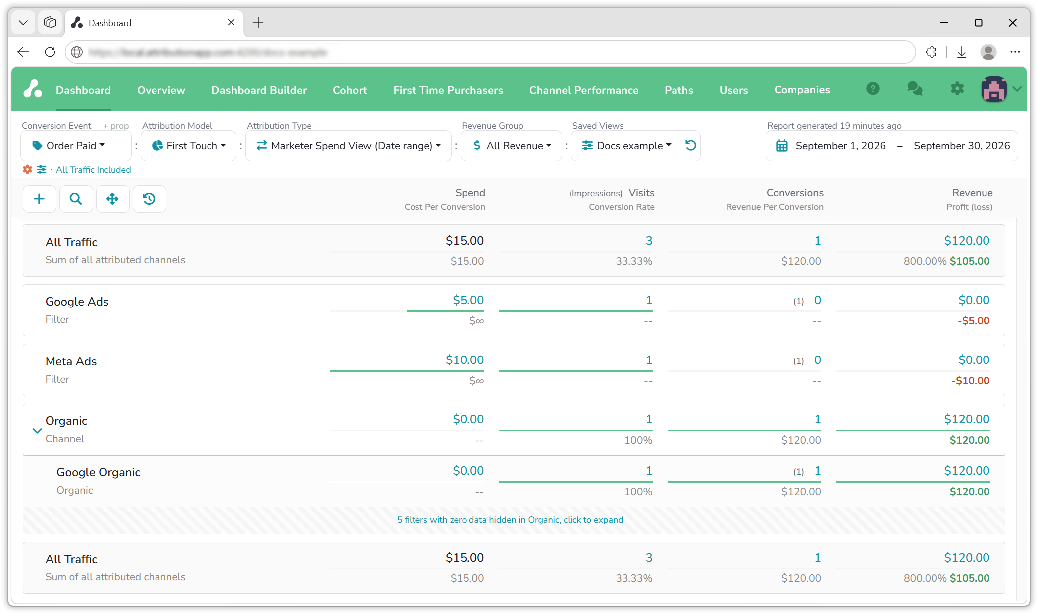
Nothing about the visitor changed; only the rule did. Every number on the dashboard is the sum of stories like this one, one per visitor, split by the model you have chosen. That is why the model is worth choosing on purpose, and why the view that holds it is worth saving for the whole team.
Where next
- Dashboard: every column, row and sidebar, on a full project.
- Attribution models: the five rules and when each fits.
- Conversions and revenue: the two settings behind the two columns.
- Default channels: the rows every project starts with, including Direct Traffic, Unsegmented Traffic and Unknown Source.
If you have any questions, write to [email protected].
Updated 44 minutes ago