
Overview
Chart the dashboard over time: any two of the eight dashboard metrics, for any channel or filter, by day, week or month, several charts to a page
Overview draws the dashboard over time. It takes the same numbers the Timeframe table holds, the dashboard by periods, and plots them, two metrics to a chart, for one source. One chart answers one question, and you keep several on the page.
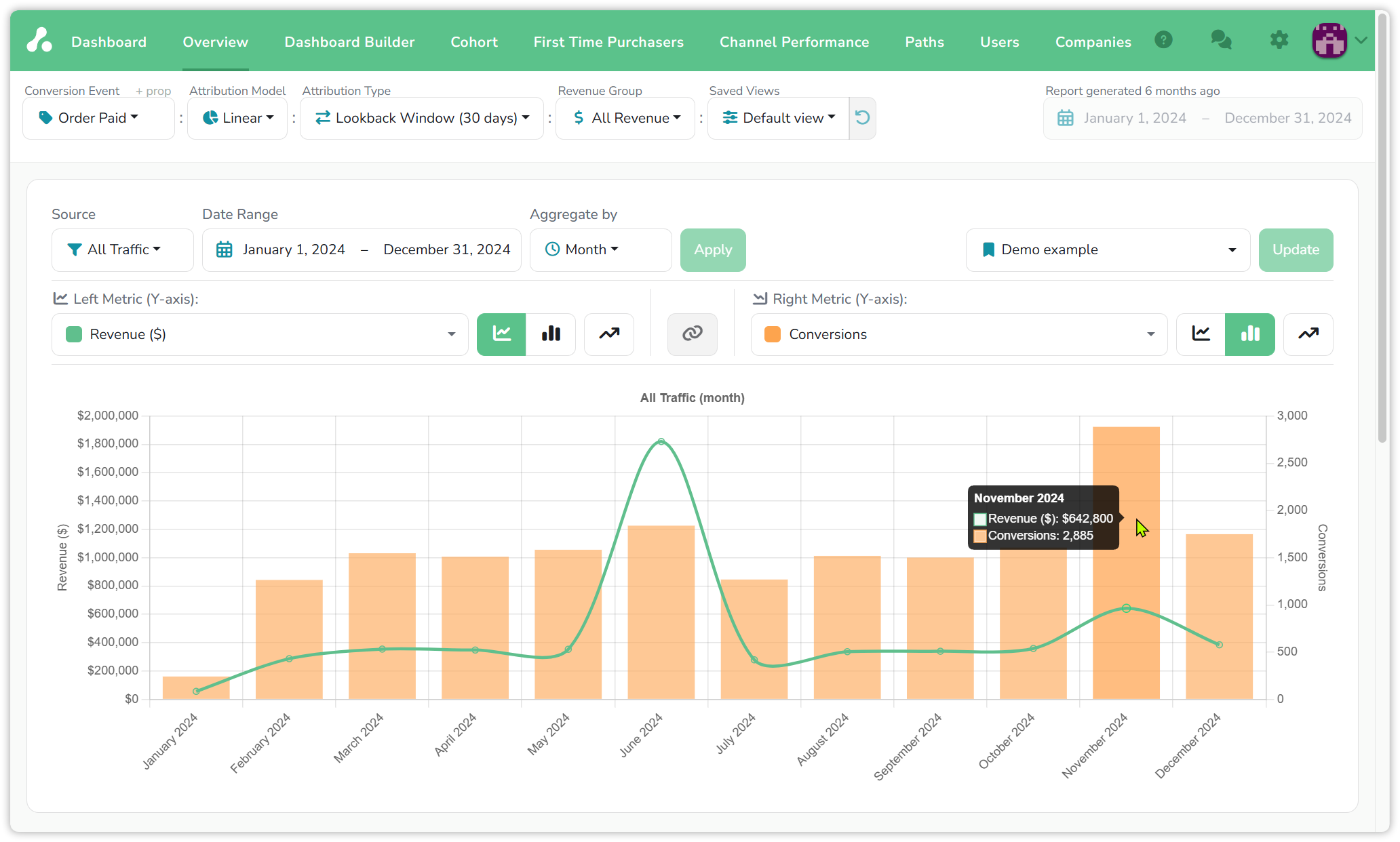
Examples: demo project, 2024, Order Paid · Linear · Lookback Window (30 days) · All Revenue, the same view as on the Dashboard and Timeframe pages.
Two metrics per chart
A chart has a left axis and a right axis, and each takes one of the eight dashboard metrics: Revenue, Spend, Profit/Loss, Cost per Conversion, Revenue per Conversion, Conversions, Visits and Conversion Rate. The metric on one axis is greyed out on the other, and None empties an axis when one line is all you want.
Two is the limit because the metrics measure different things. Dollars, counts and percentages each need their own scale, and a third would have nowhere to go.
Two scales on one chart is also where the report earns its place. In the example, Revenue is a line and Conversions are bars for All Traffic across 2024. June's revenue peaks near $1.8 million while June's conversions bar is no taller than its neighbours: fewer, larger orders. November is the opposite, 2,885 conversions for $642,800, the most orders of the year at a lower value each. The dashboard total for the year says neither.
What comes from the control bar, and what is per chart
The control bar at the top sets what every chart on the page measures:
- Conversion Event, Attribution Model, Attribution Type, Revenue Group and the Saved View.
Each chart sets what it shows and when:
- Source: All Traffic, or any channel or filter.
- Date Range and Aggregate by: the period the chart covers and the width of each point, Day, Week or Month. Click Apply after changing them.
- The two metrics and how each is drawn.
The control bar's own date range is greyed out here, because dates belong to the chart. Change anything in the control bar and every chart is redrawn under the new setting, keeping its source, dates, period and metrics.
Shaping a chart
Next to each metric are three buttons. The first two draw it as a line or as bars; the third adds a trendline, a straight fit through the points. Between the two metrics sits the link button: when both are in dollars, Spend against Revenue say, it puts them on one shared scale so the gap between them is to size. Metrics in different units keep their own scales.
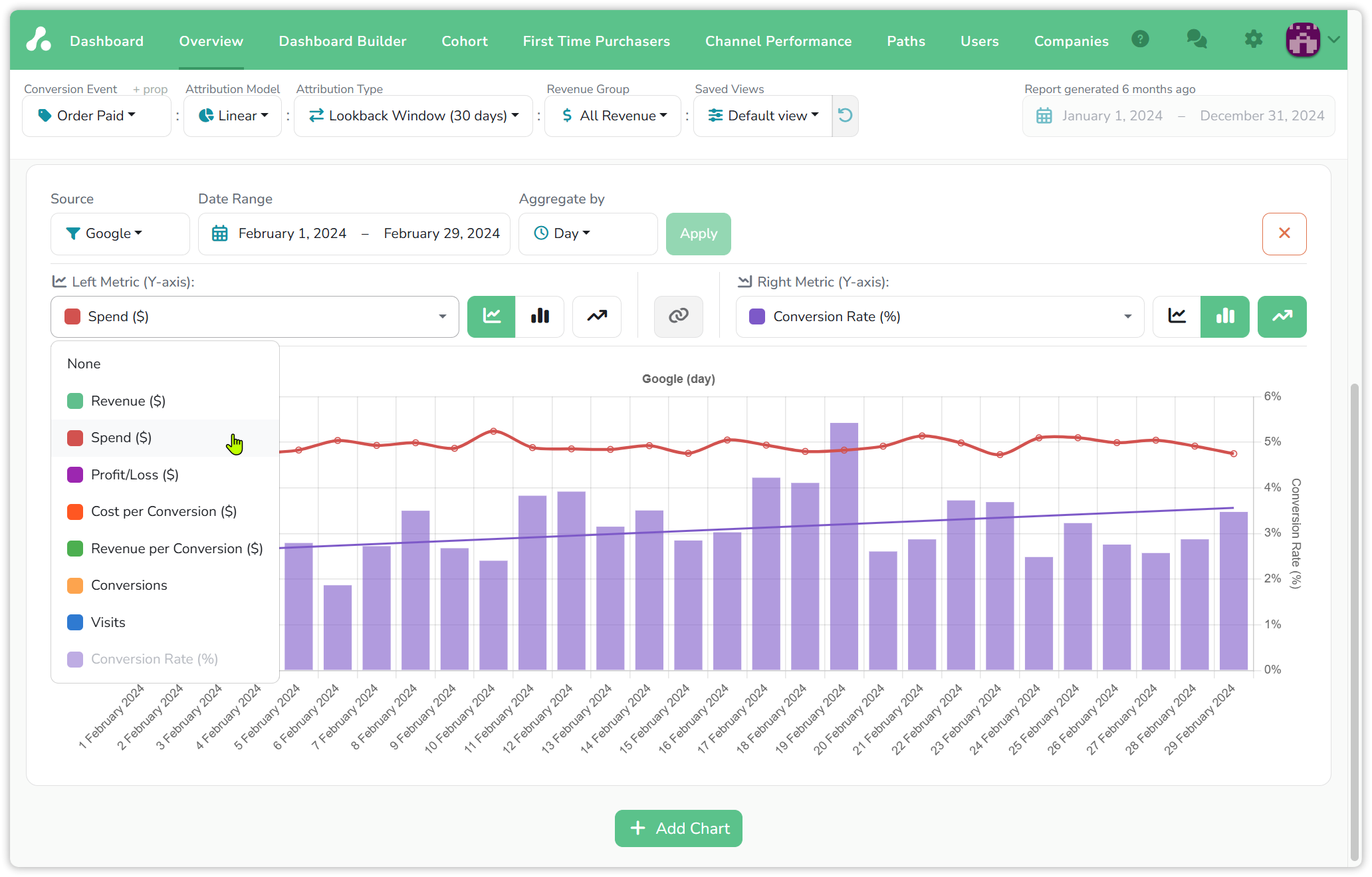
In the second example the source is Google, February by day. Spend is a line and barely moves. Conversion Rate is bars, noisy from day to day, and its trendline climbs from about 3% to about 3.5% across the month. Same budget, a better rate by the end of it; the daily bars alone would not have shown the direction.
Presets and several charts
Add Chart at the bottom of the page adds another, and the cross in a chart's corner removes it. Charts stack, so a page can hold the year at a glance on top and the channel you are working on by day below.
The dropdown at the right of a chart's settings holds presets: a saved chart setup, with its source, date range, period and metrics. Pick one to apply it, change the chart and click Update to save the change back. Presets are shared across the project, so a chart a colleague set up is one click away for you. They do the job saved views do for the control bar, one level down.
Reading the numbers
- Same model, same type. A chart reads the Attribution Model, Attribution Type and Revenue Group from the control bar, so a point on it is the dashboard's number for that period; see Attribution types for how the type moves credit between periods.
- Conversion Rate is conversions divided by visits for the period, so it is a percentage of the source's own visits.
- Periods follow the range. Day is available for a range up to about 100 days, Week up to about a year, Month for any length, as on Timeframe.
- To see the rows behind a point, open Timeframe at the same period: every number there opens the sidebar.
Updated 20 days ago