
Channel Performance
The dashboard as charts: what went in, what came back, which channels carried it, and how much of that depends on the attribution model
Channel Performance is the dashboard summarised for a meeting. Six numbers at the top, then return by period, return by channel, where the spend and the revenue went, and every channel under all five attribution models. Nothing here is new data; it is the dashboard's numbers drawn so that the shape is visible before the detail.
There is no Conversion Event in the control bar. The report counts sales from the Revenue Group: every event in the selected group that carries revenue is a sale, as in First Time Purchasers.
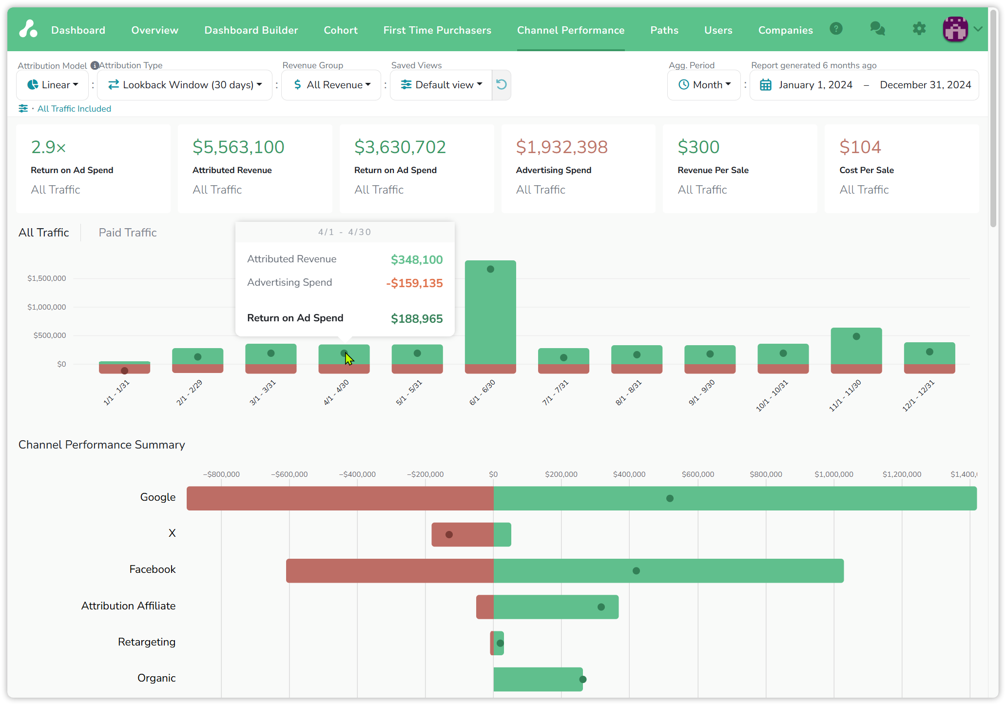
Examples: demo project, 2024 by month, Linear · Lookback Window (30 days) · All Revenue.
The summary cards
Six cards, all for the selected period and, until you pick a channel, for All Traffic:
| Card | What it is | 2024 example |
|---|---|---|
| Return on Ad Spend, as a multiplier | revenue ÷ spend | 2.9× |
| Attributed Revenue | revenue the model credits to the channels | $5,563,100 |
| Return on Ad Spend, in dollars | revenue − spend | $3,630,702 |
| Advertising Spend | spend from the ad integrations and entered by hand | $1,932,398 |
| Revenue Per Sale | revenue ÷ sales | $300 |
| Cost Per Sale | spend ÷ sales | $104 |
Each is rebuilt from the dashboard's totals, so a card that surprises you can be checked there in a minute.
Return by period
The first chart draws one bar per period: revenue above the line in green, spend below it in red, and a dot for the return, revenue minus spend. Hover a bar for the figures. April 2024 is $348,100 of revenue against $159,135 of spend, a return of $188,965. June stands out as the year's peak, the same June that Overview shows as a month of fewer, larger orders.
The tabs above the chart are your dashboard groups. All Traffic is always there; the demo project also has a Paid Traffic group, so the same chart can be drawn for the paid channels alone. Any group you create on the dashboard appears here as a tab; see Channels, filters & groups.
Return by channel
Channel Performance Summary draws one horizontal bar per channel, with spend to the left of zero and revenue to the right, and the dot again marking the return. The longer the green side relative to the red, the better the channel paid back. In the example, Google and Facebook are both far into the black. X is the one channel in the red: its spend bar is longer than its revenue bar. Organic has revenue and no spend, so its bar starts at zero.
Choosing a channel scopes the whole report to it: the cards, the period chart and the distributions redraw for that channel, and its name replaces All Traffic under the cards.
Where the money went
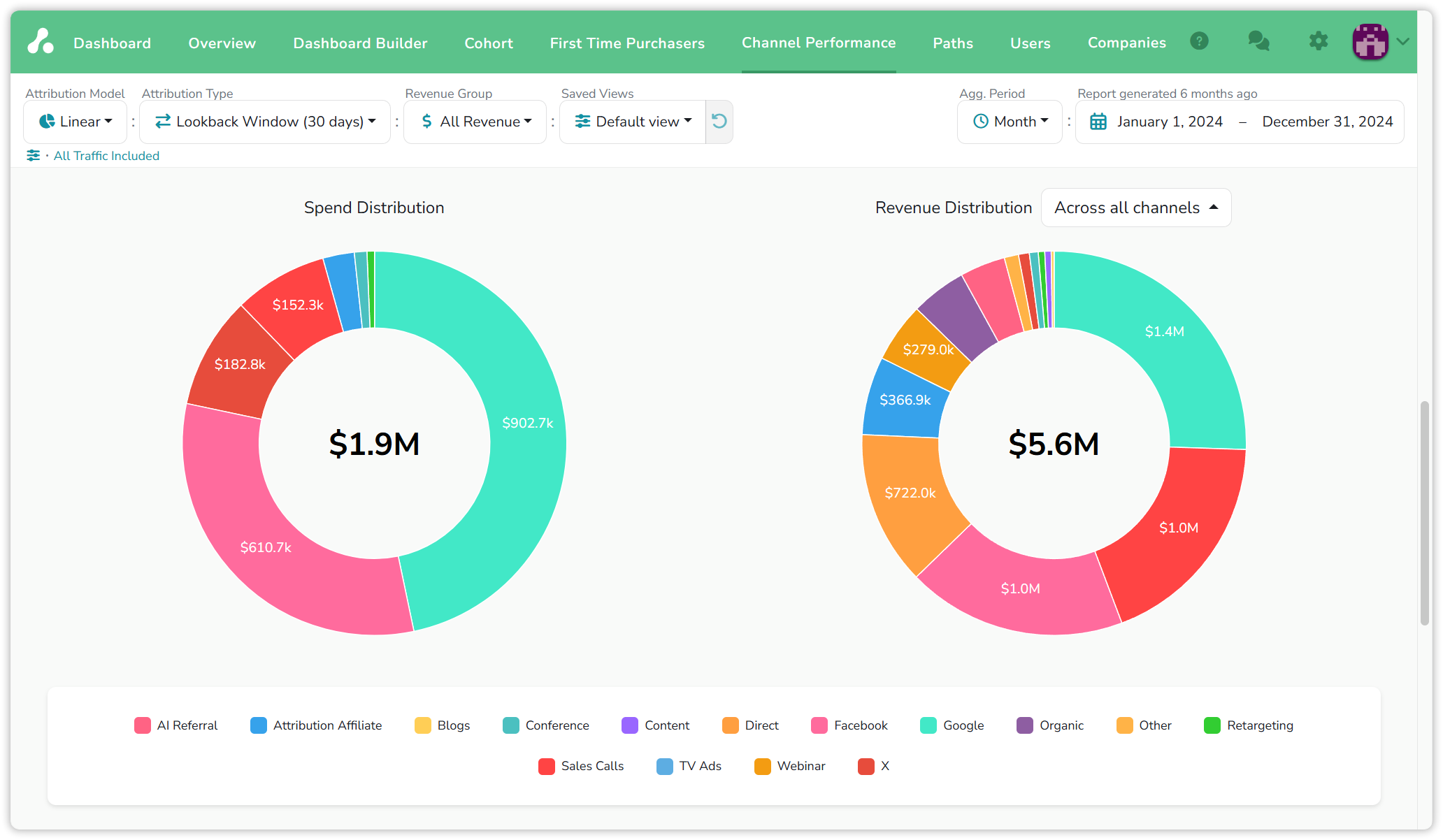
Two donuts, spend on the left and revenue on the right, each slice a channel. Google took $902.7k of the $1.9M spent and returned $1.4M of the $5.6M earned, so its share of revenue is smaller than its share of spend. Facebook is the reverse, $610.7k in and $1.0M out. The switch on the revenue donut, Across all channels or Across paid channels only, drops the unpaid slices such as Organic and Direct, so the two donuts compare like with like.
Attribution Model Comparison
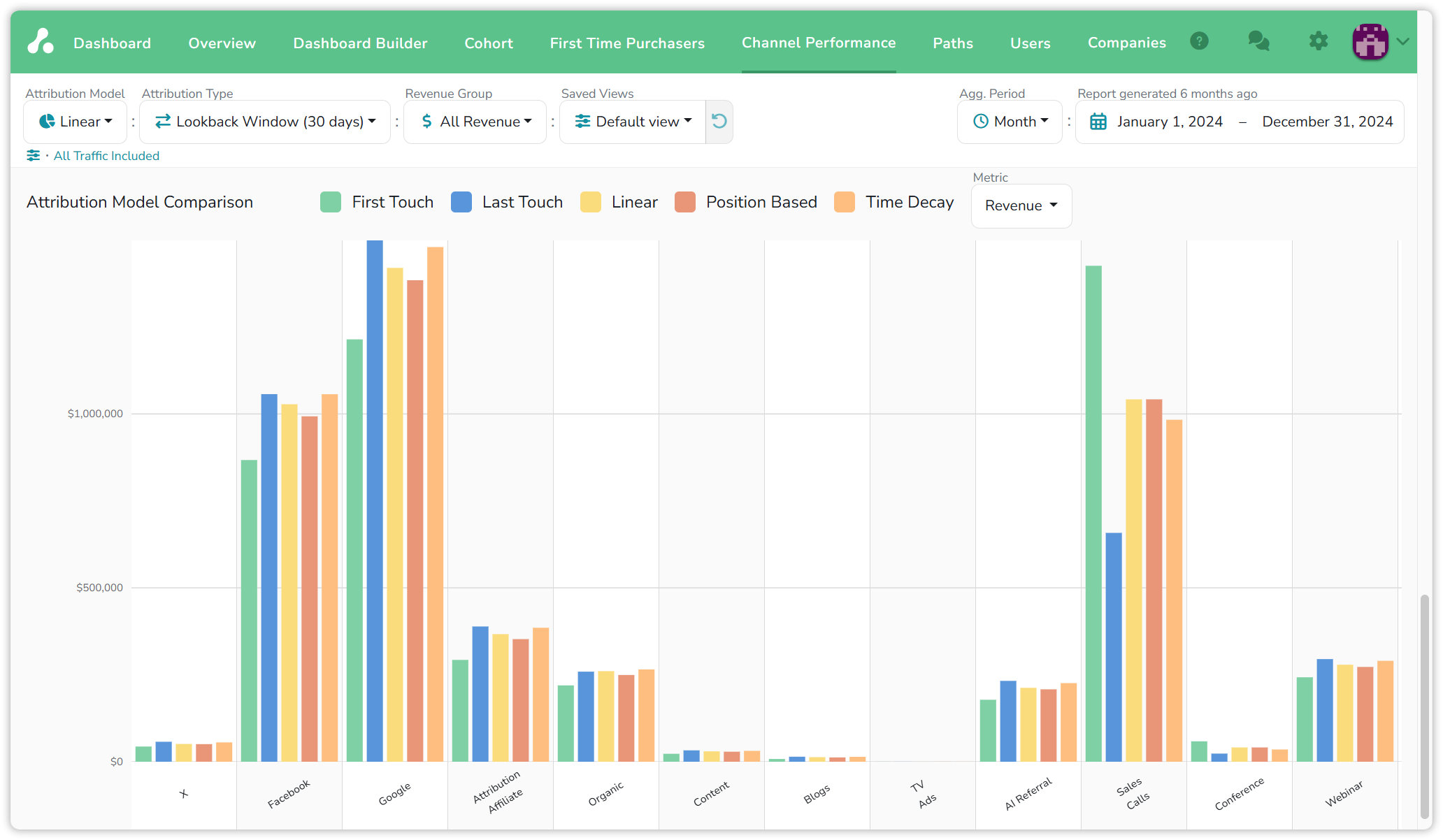
The last chart answers the question every dashboard reader asks eventually: how much of this depends on the model? Each channel has five bars, one per model: First Touch, Last Touch, Linear, Position Based and Time Decay. Metric switches the bars between Revenue and Conversions.
Read the shape of a channel's five bars. A channel that is tall under First Touch and short under Last Touch opens journeys: it brings people in and others close the sale. Sales Calls is the clearest case in the example. A channel tall under Last Touch and shorter under First Touch closes them; Google is the reverse of Sales Calls. A channel whose five bars are level earns the same credit whatever the model, so its number on the dashboard is safe to quote. The rules behind each model are on Attribution models.
Reading the numbers
- The two returns are one calculation. The multiplier is revenue divided by spend; the dollar figure is revenue minus spend. The dashboard's ROAS column and Profit (loss) column are the same pair per row.
- The Revenue Group decides what a sale is. Switch the group and Revenue Per Sale and Cost Per Sale change with it.
- Attribution Type moves credit between periods. Under Lookback Window a sale sits in the period it happened; under Marketer Spend View the credit sits with the visit; see Attribution types.
- The model comparison redistributes, it does not add. All five models share out the same sales, so the total across channels is the same under each; only who gets it moves.
Updated 20 days ago